Infectious Disease - Graphs
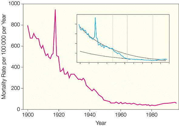
The inset shows the same mortality curve (blue line) with the fitted regression lines for 2 (1900-1937 and 1953-1980) of 4 segments. The boundaries between the segments are indicated by the vertical dotted lines.
Results of the JAMA Study
Figure 1. Crude Infectious Disease Mortality Rate in the United States from 1900 Through 1996
With the exception of 1918, when the influenza epidemic struck, [which was CAUSED by the flu vaccination campaign] the rate of deaths from infectious diseases show a fairly smooth rate of decrease from 1900 through 1980, at which point a slight rate of increase develops. This link shows the associated JAMA graph: ( http://jama.ama-assn.org/cgi/content/fu...) .
Deaths graphed by groups of diseases show some variations, but interestingly,the most significant improvements are in typhus and dysentery ( http://jama.ama-assn.org/cgi/content/fu...) . Both of these diseases show almost no deaths after 1960. Interestingly, there is no vaccination for dysentery and most people are not vaccinated for typhus.
Tuberculosis rates show a curve similar to the overall infectious disease rate.
The death rate from pneumonia and influenza from 1970 through 1996 shows a general increase, in spite of the ongoing vaccinations for influenza and the introduction of pneumonia vaccines in 1977 and 1983.
Diphtheria shows its greatest decrease of deaths prior to 1920. There was a spike in diphtheria deaths during the early 1920's, shortly after the vaccination was introduced, and then the rate of decrease continued as before the vaccination's introduction. Whooping cough (pertussis) and measles showed the same general trend of decrease during the 20th century.
Finally, take a look at the chart for death rates from all disease causes ( http://jama.ama-assn.org/cgi/content/fu...) . From 1900 through the 1920's, the infectious disease rate goes down at an impressive pace. This is a time during which there were no vaccinations against childhood diseases. The rate of decrease of deaths from 1940 through 1960 continues at about the same pace. Then, it starts to level out, in spite of the fact that the vast majority of children are vaccinated during this time.
Now, take a look at the same graph showing the death rates from all causes. This should make you nervous. The rate of death from all disease decreases slightly from 1900 through 1920. However, after this, when vaccinations start to be introduced, the death rate from noninfectious causes starts to increase. It isn't a huge amount, but it's definitely there. Most significantly, the increase in death rate from noninfectious causes starts when vaccinations are introduced.